Summary: Latitude vs. X
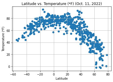
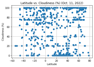
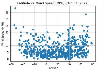
The purpose of this project was to analyze how aspects of weather change the closer a city is to the equator. To do so, data was pulled from the OpenWeatherMap API to assemble a dataset on over 500 cities.
Once assembled, Matplotlib was used with the dataset to plot each weather aspect against latitude. The weather aspects were: temperature, cloudiness, wind speed, and humidity. This site provides the source data and visualizations created as part of the analysis, as well as explanations and descriptions of any trends and correlations witnessed.
Visualizations